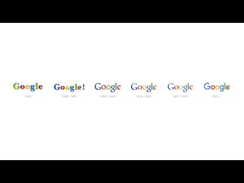
Google has changed its logo for the first time since 1999, as the company continues to undergo massive changes following its restructuring and the creation of its parent company Alphabet.
The new logo has brought to an end its relationship with serifs, the small lines that adorned the edges of the previous logo’s lettering. While Google’s logo has changed since the company was founded in 1998, this change represents the most drastic alteration to look since ’99, and represents the first time the company has done away with the serifs since then.
The evolution of the Google logo was documented in a video uploaded by the company, highlighting how the logo has also changed for its implementation in Google’s favicon (the icon that appeared in the URL bar).
Watch the video below:
The logo change has been made due to it scaling better than the logo of old, according to Google. According to the company, its use of serifs meant that when the logo or favicons were decreased in size, they could resemble other letters or numbers, something which the company weren’t comfortable.
As such, they have now opted for a bold ‘G’ sans serif that looks like the letter G no matter its size. It’ll also be easier to load for low-bandwidth users, utilizing a Scalable Vector Graphic that is the optimal format for a logo, meaning that it will now use up less bandwidth in order for the logo to be visible by all users.
Following Google moving under its new holding company, this is the first major change to the search engine that the general public have witnessed thus far. Will we see any more changes made to it in the near future?


